 As catchy as the title is of today’s post, it has very little (but not, nothing) to do with the image on the left …
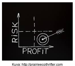
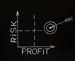
… which image simply serves to illustrate my preferred – or, should I say ‘accepted’ – approach to investing.
But, wait, you say!
Surely, the quadrant to the bottom-right (where the combination of profit and risk is optimized) is the most efficient?
.
So, why would I want my arrow to hit the target in ‘no mans land’?!
Well, that’s the exact question that I threw to my readers in my last post …
There were a lot of amazing comments (and, you should go back and read them all), but Dustin wins a signed copy of my book for his comment, which summarizes my views nicely:
there are significant gains to be made with a moderate increase to your risk … however the long term of the investment should moderate that for the endgame result. Technically it is a less “efficient” investment, but only statisticians care about that, not real world investors.
And, JD earns an ‘honorable mention’ (and, also wins a signed copy of my book) for his comment, which adds a crucial caveat to my views:
I worry less about potential losses for incremental investments. I may be biased since I am young enough to earn it back (I’m in my late 20s)
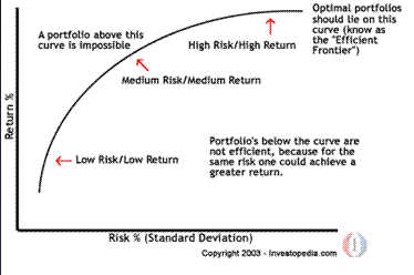
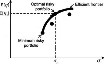
Whilst I would argue (as would Warren Graham who provided the source chart and much valuable commentary to my original post), that learning about the efficient frontier is valuable to investors, not just statisticians, Dustin has hit the nail on the head by focussing on the “endgame result” …
… for me, your overall investment objective drives everything.
The aim, in my opinion, isn’t to find the optimal investment where ‘optimal’ is defined as sitting on some curve, it’s to find the investment from the limited range typically available to you in the real world that delivers the result that you need.
If you’ve been following this blog for a while, you’ll realize that – in order to pin down that ‘result that you need’ – I advocate a Top Down Approach To Investing:
This means, knowing how much money you need; when you need it; and, using those answers to derive your required annual compound growth rate.
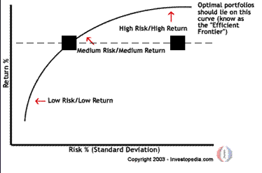
It’s this growth rate, as indicated by the horizontal line on the chart below (the positioning of this line will be different for everybody) that should dictate what investment choices you go after:
Each of these investment choices (and, in my experience, there will be very few to choose from, since you need access, education, and aptitude in each type of investment in order to proceed) will bring with them their own risk profile …
… and, you will be amazingly lucky, if one of those choices (e.g. as represented by the black squares on the chart above) happen to fall on the intersection of the horizontal line and the ‘efficient frontier’ curve.
If not, and if you want to achieve your Number by your chosen Date [AJC: you do, don’t you?], you will go ahead and make that investment, anyway, even if it doesn’t fit neatly in the quadrant on the bottom-right of the image at the top of this post.
Because, as JD says, even if your investment fails, hopefully, you will still be “young enough to earn it back”.
We get one opportunity to live our Life’s Purpose; we get many opportunities to make investments to help us get there, but only if we have the mettle to choose the ones that have the potential to meet your minimum required annual compound growth rate.
To me, the investment choices that can help us reach our Number are the most effective of investments …
… they just may not be the most efficient 😉
.
.

